Our Work
Bold Ideas. Passionate Design.
Collaborating with hundreds of businesses in diverse industries from medtech to automotive to industrial to consumer, we solve problems in unexpected ways — creativity that benefits our customers and energizes our team. We invite you to explore some of our recent work.
Challenge: VISIE is poised to revolutionize robotic surgery with its cutting-edge 3D spatial computing technology. The team’s deep-tech optical platform provides exceptional precision — over 10 times more accurate than current industry standards and designed to enable robotic-assisted systems to visualize anatomy in 3D detail and in real-time, just like surgeons do when they look at their patients. To attract partners in the medical device industry, VISIE needed a powerful demo to showcase its transformative technology.
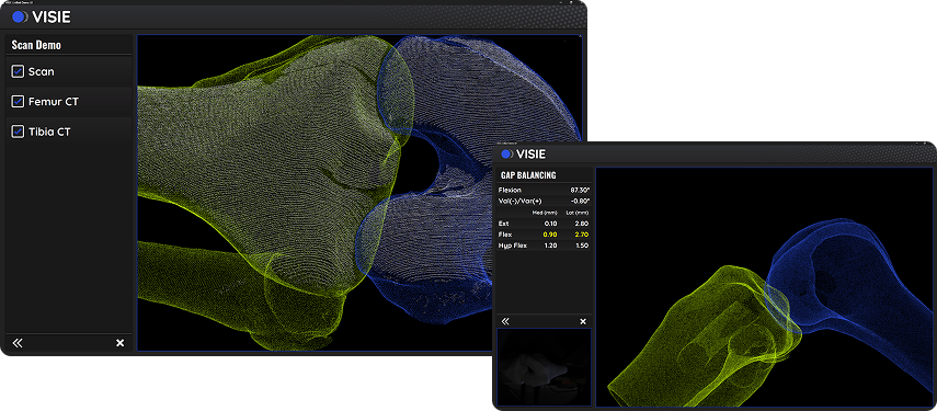
Solution: VISIE turned to us for Qt development and UI design to bring VISIE’s high-resolution scans to life, highlighting the clarity and precision that sets their system apart. The biggest design challenge involved ensuring that VISIE’s ultra-high-definition 3D images look perfect on both small, low-resolution medical device screens and large 50-inch 4K TVs. We tackled this by developing a UI that seamlessly displays complex 3D point clouds with pixel-perfect clarity, even when viewed on drastically different screen sizes. This required careful attention to scaling, resolution and layout. (Our development team also overhauled VISIE’s tech stack to support the streaming and visualization of 3D scans in real-time.)
Result: We delivered visually stunning demos that persuasively demonstrate the full potential of VISIE’s transformative technology, bringing it to life with an experience that intrigued prospective medical device partners and helped solidify VISIE’s position as a trailblazer in robotic surgery.
CHALLENGE: Revolution Cooking was on a mission to reinvent toasting from the inside out. To create a better toasting experience, this Massachusetts-based company developed a groundbreaking heating technology dubbed InstaGLO® that sears bread rather than dehydrates it the way traditional toasters do. The company brought InstaGLO® to market in the two-slice Revolution InstaGLO® R180 Toaster, built around a large touchscreen with options for a variety of bread types. Eye-catching and technologically advanced, the InstaGLO® R180 quickly became the #1 smart toaster — but the actual user experience it delivered was not up to Revolution Cooking’s standard of innovation. The company turned to Boston UX to make important adjustments to the UI to ensure a more seamless and user-friendly experience.
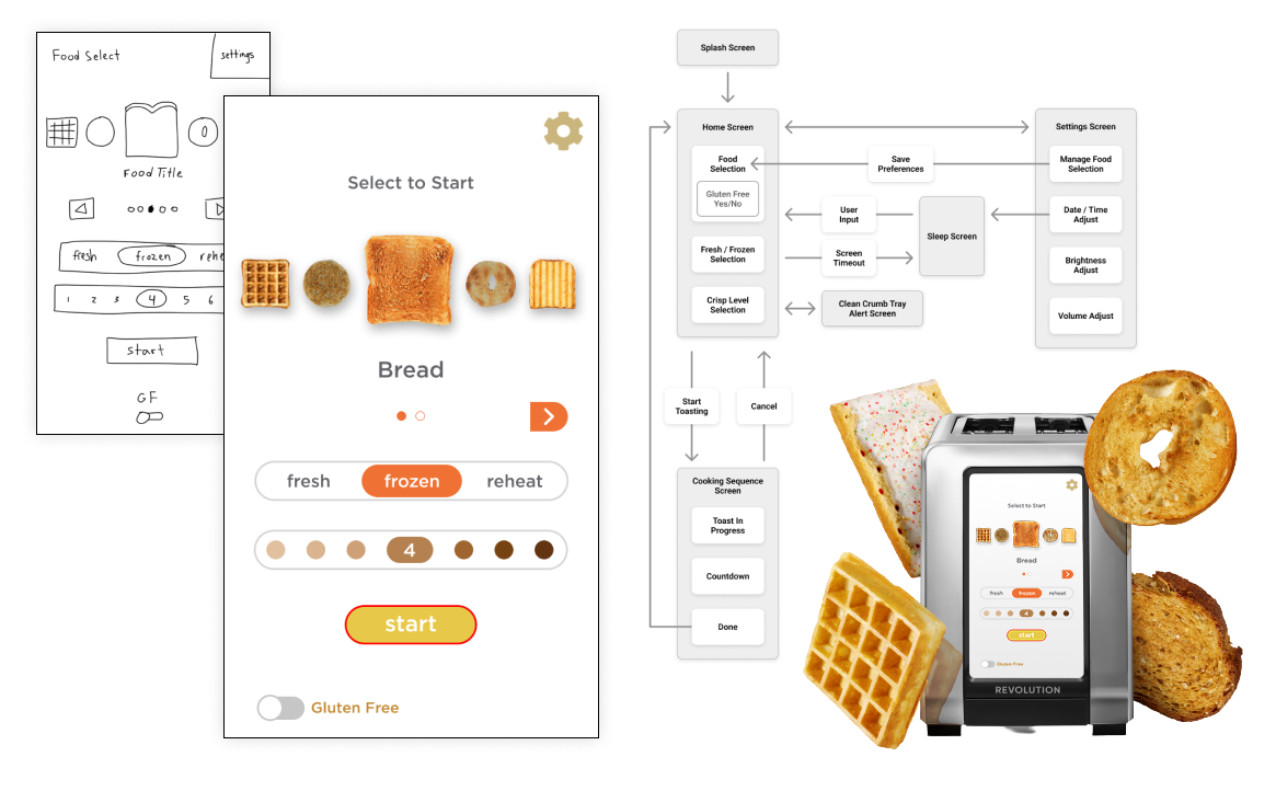
SOLUTION: Boston UX delivered work that was grounded in Revolution Cooking’s existing look and feel but addressed user pain points and improved the workflow. Specifically, the team created and documented a brand-specific design system in Figma to describe how users interact overall and within each functionality, and expressed how design should be applied to certain features, such as instructions and error messages. The result was a more appealing and intuitive user experience that customers loved.
RESULTS: On the heels of this success, Revolution Cooking asked Boston UX to do the same for the more powerful and feature-filled Revolution InstaGLO® R270, which incorporates 34 bread types including Gluten Free, as well as modes for panini press and warming rack accessories. Boston UX made some wholesale improvements in the UI while remaining true to the existing aesthetic Revolution Cooking had already established. Boston UX also created and documented a brand-specific design system in Figma, describing in detail how users interact with the product overall and within each functionality.
CHALLENGE: Partially funded by the Department of Homeland Security and the Department of Defense, NUARI is a leading provider of scenario-based cybersecurity exercises for critical infrastructure organizations. NUARI asked Boston UX to help them reimagine their legacy DECIDE® Platform to create more impactful cybersecurity exercises in a world with escalating threats.

SOLUTION: The existing Windows-like platform was dated and difficult to navigate, forcing participants to spend much of their limited training time learning how to complete the exercises rather than actively engaging with the scenarios. To address that issue, Boston UX designed a new, less complex information architecture that made navigating the platform quicker and easier, and enhanced NUARI’s ability to onboard new users. Boston UX also designed an intuitive drag and drop interface and devised other creative ways to allow players to seamlessly access the right information at the right time, which enhances the quick decisions necessary during a real incident. The team also created a flexible design system, including wireframes, a full component library and a working prototype.
RESULT: The redesigned DECIDE® Cybersecurity Exercise Platform is a dramatic departure from the original look and feel, yet still respects NUARI’s established branding. These upgrades, along with improved navigation and increased flexibility to add and customize content, better engage users and ensure the application will continue to be relevant even as the threat landscape evolves.
CHALLENGE: Boston UX helped a customer create a bedside patient monitoring system that displays ECG, pulse oximetry, blood pressure and the patient’s medical record. Based on an existing device, the system needed a new, highly usable interface that is simple to use by both medical practitioners and untrained caregivers, and supports in-home video calls from a physician.
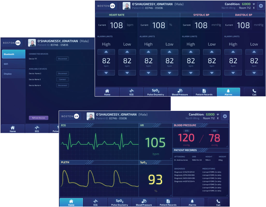
SOLUTION: Boston UX designed an intuitive, modern visual interface by rearranging and enlarging the size of the existing navigation buttons to better suit a user’s workflow, swapping out the hard-to-read fluorescent color scheme, and reorganizing the home screen so users could quickly see the most essential information in one glance without having to move to a different screen.
CHALLENGE: We designed and developed a connected IVI solution for Intel’s product family of In-Vehicle Solutions, which offers optimized hardware and software foundations for automakers and suppliers. The Intel system needed to showcase impressive graphics capabilities and ease of use, along with core features, such as navigation control, multimedia audio and video, climate control and vehicle diagnostics.
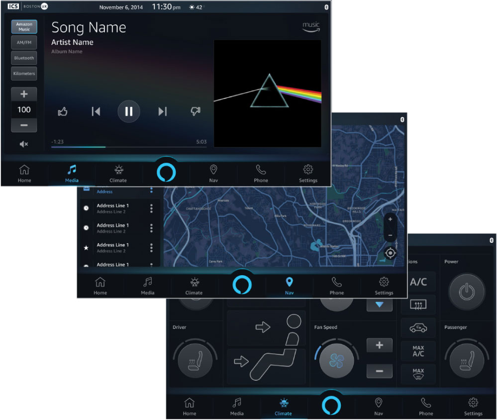
SOLUTION: Our solution, designed to fit seamlessly into the Amazon Alexa Auto experience, incorporates voice-enabled support for and control over cloud-based music services and input (e.g. “Alexa, where is the nearest pet store?”). The system provides visual feedback about the state of the Alexa service to foster intuitive and safe operation.
CHALLENGE: An innovator in ultrasonic welding planned to introduce a new generation of its powerful IoT-enabled tools. They wanted to leverage the latest touchscreen technology for a streamlined user experience, as well as incorporate advanced analytics. The company’s human factors team had worked on the project but realized this challenge demanded deeper expertise. They asked Boston UX to create an intuitive UI to control devices in lab and production settings, and run automated arrays transacting complex sequences.
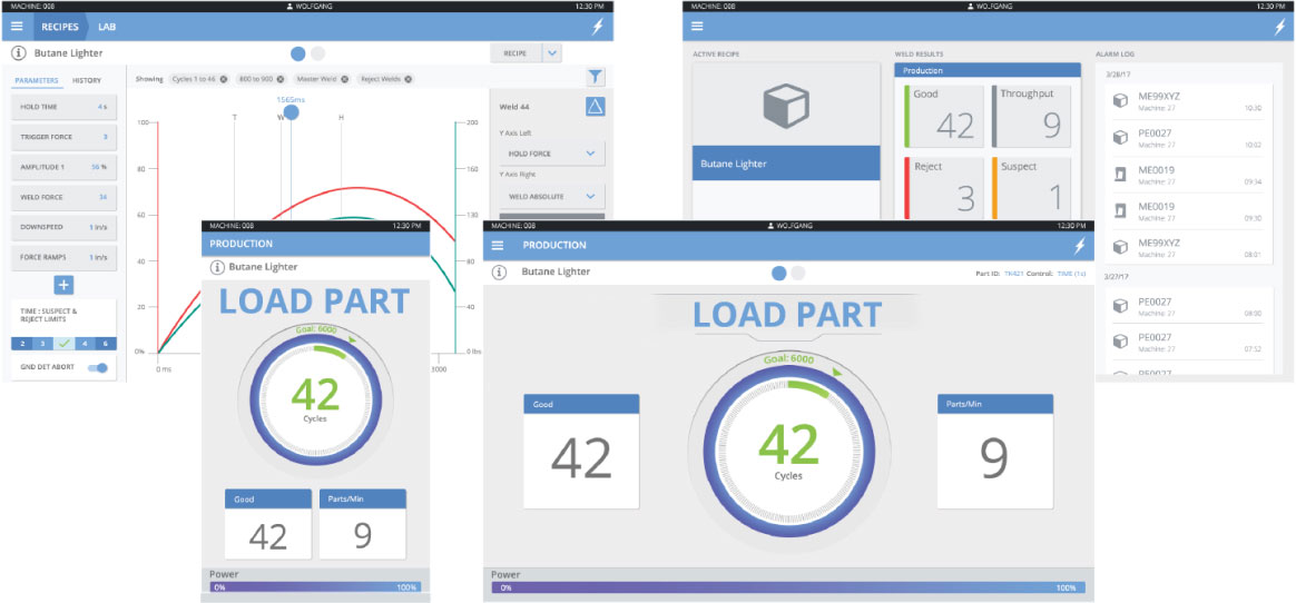
SOLUTION: We analyzed the legacy system, identified usability issues, revised the information architecture to support more-efficient interactions, and created a detailed interaction design. Working with our customer’s subject experts and testing our work with real users, we designed a modern control system optimized for a variety of screens, including laptop and embedded, and a mobile version for remote monitoring. In doing so, we transformed the user experience for operators, production managers, field techs and engineers.
CHALLENGE: Setra Systems Inc. aimed to bring its innovative indoor environmental control monitoring solution to life. Setra FLEX™ is wall mounted in operating rooms, clean rooms and similar areas to monitor pressure, humidity, temperature and airflow. Setra wanted an intuitive UI that could control three rooms at once and be used without prior training by medical professionals and operations personnel.
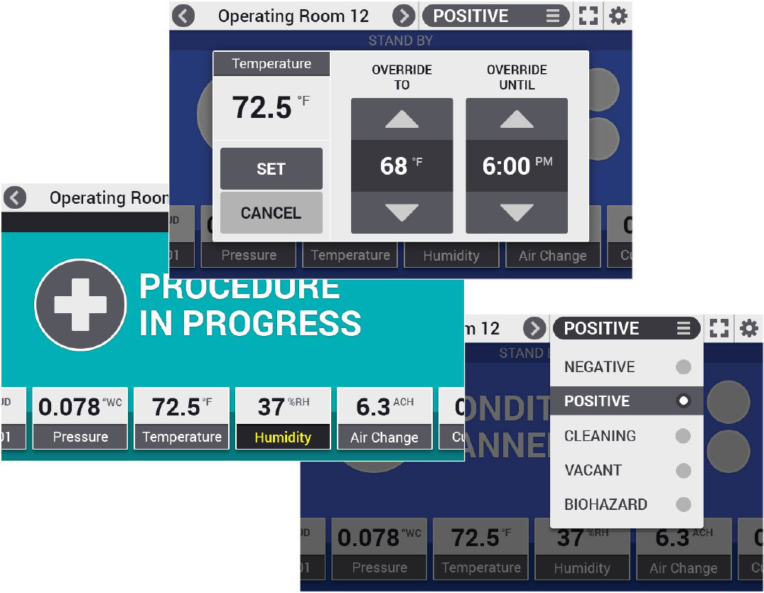
SOLUTION: Boston UX analyzed Voice-of-the-Customer data and created personas to provide the research-backed context on which to build an effective design. Then, we created intuitive navigation featuring a large condition banner and an array of parameters that can shift laterally to reveal additional readings. Emphasizing legibility, the UI used large touch targets and a simplified design so the screens would be easy to read from a distance. We added gesture control so users could quickly navigate screens, even while gloved.
CHALLENGE: OsteoCentric Technologies has revolutionized screw technology for orthopedic implants, empowering orthopedic surgeons to best assist their fracture patients. OsteoCentric’s Unifi mechanical integration technology is less invasive and more effective for bone preservation than traditional methods. As a young firm, OsteoCentric needed a creative way to garner brand recognition and promote its state-of-the-art technology to orthopedic surgeons.

SOLUTION: We addressed this need by developing three creative elements: a large-format digital experience, a more intuitive and responsive website, and a progressive web app to track surgical cases. The interactive kiosk experience allows OsteoCentric to showcase its revolutionary technology at medtech trade shows and events in a way that draws attention and deepens engagement. The progressive web app, accessible via iPad or through a web browser, provides clinicians with a convenient way to keep track of their patient cases that incorporate use of OsteoCentric’s implants. Surgeons can catalog each implant and record data on its use, as well as upload X-rays, MRIs and other pertinent imaging. The case app does not include patient names or any personally identifiable information, and strictly adheres to HIPAA rules.
With their award-winning TruCare® Population Health and Care Management Platform, Casenet is transforming how healthcare is managed in order to deliver better patient outcomes at lower costs.
Casenet's configurable, scalable TruCare platform unites disparate data sources to create a 360-degree member view, which allows for improved delivery of care at appropriate costs. The platform is used by health plan care managers to coordinate care. Data captured in the TruCare platform includes demographic information, care plans, authorizations, and referrals.
CHALLENGE: TruCare contains several robust data modules, including case management, disease management, utilization management, appeals and grievances, reporting and analytics. Casenet looked to Boston UX to create an intuitive interface to ease the burden on users who must manage monumental amounts of information.
To do so, Boston UX's design team would need to study electronic medical records, health plan processes, and patient information-gathering practices to understand how to best organize and present this complex information, and then apply this knowledge when creating an innovative solution.

SOLUTION: Boston UX observed Casenet customers actually using the current TruCare system, and conducted a number of related focus groups. Boston UX also hosted weekly participatory design meetings with Casenet and their end users in order to get feedback regarding in-process designs and workflows.
In all, Boston UX completed four detailed usability studies for this project, analyzed their findings and prepared several written reports. One outlined major pain points, suggested areas for improvement, and provided high-level design recommendations. Another provided user background data and detailed user satisfaction with the current system, comparing findings across user roles.
To create the next generation of TruCare, Boston UX built an entirely new information architecture.The team designed new navigation, and created highly detailed wireframe simulations for 80% of the screens slated for the final program, focusing on those for Casenet's most complex workflows. Boston UX also designed templates that could be used for multiple sections of the large application.
"Because our clients must manage vast amounts of information that is diverse and ever-changing, it is imperative that we provide them with tools to do so in a manner that is intuitive and designed to address their specific needs and nuances," said Margie Caughey, Vice President, Product Management at Casenet. "To achieve this, we needed Boston UX designers to become deeply immersed in both our and our clients' worlds."
RESULTS: The work Boston UX has done is evident in Casenet's latest major TruCare release. From the start, Boston UX's goal has been to put Casenet in the best position to manage care with confidence so expectations for the new TruCare release are high. Boston UX conducted extensive usability research up front and incorporated the highly specific user feedback into the wireframe designs, so both Boston UX and Casenet anticipate the enhanced platform will be met with enthusiasm and widely embraced.
CHALLENGE: OMG Roofing Products had great success with its electromagnetic induction welding system and was ready to take things up a notch. They asked Boston UX for help enhancing RhinoBond’s user experience, which meant incorporating a touchscreen with a modern interface. But workers typically wear heavy work gloves while operating the device, making the use of a traditional touchscreen problematic. In addition, RhinoBond is used under harsh, direct sunlight, making it very difficult for workers on rooftops to read the controls. What’s more, those workers use RhinoBond while standing so the screen must be readable from a distance, not just up close like with a cell phone.
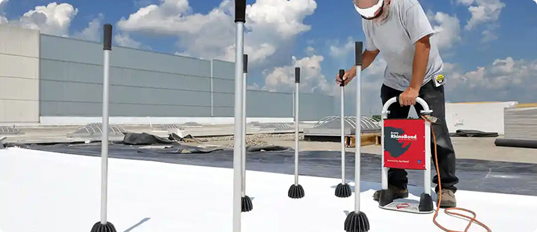
SOLUTION: OMG Roofing Products selected a resistive touchscreen to replace the device’s original LCD screen and membrane buttons. This type of touchscreen works well in the elements and easily accommodates users wearing gloves, something difficult with the more widely used capacitive touchscreens found on smartphones. However, because resistive technology limits the gestures that can be used to control the screen, Boston UX focused on creating a powerful user experience that required mostly tapping motions to manipulate content, rather than swipe or zoom. To address the issue of extreme rooftop brightness, which can render a screen essentially useless, Boston UX carefully selected colors and a clean, angular typeface that would read well under such adverse conditions.
RESULT: The project was completed on an accelerated schedule, and considered a huge win by both OMG Roofing Products and Boston UX. The secret to success on this project was understanding the context of the usage by watching workers actually use the RhinoBond, and exploring in depth what they want and need from the device. This insight allowed Boston UX to create powerful screen designs that supported an engaging and intuitive interface.


